Updated on 26 June 2026 · by Pepe, painter in Elche
The bedroom is for resting, and colour affects how you feel when you walk in more than you'd think. I'm Pepe, a painter in Elche on the Costa Blanca, and I'll tell you which tones bring calm and which are best left for other rooms.
The tones that work best
For sleeping well, go for soft, low-saturation colours that are easy on the eye:
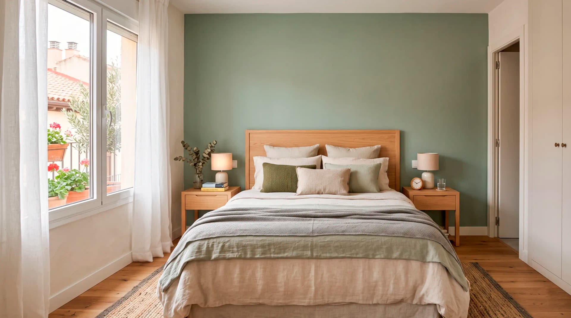
- Dusty blues and soft greens (sage, aqua): the most relaxing, they bring calm.
- Warm neutrals (beige, sand, greige): cosy and timeless, they go with everything.
- Terracotta and soft earthy tones: warmth without stirring things up, very much on-trend.
- Off-white: if you want light and space, with soft furnishings adding the colour.
What to avoid in the bedroom
Very bright or stimulating colours (deep reds, strong oranges, loud yellows) rev you up rather than relax you, so in the bedroom it's best to keep them for a small detail, not for the walls. Strong sheens are tiring too: in the bedroom a matt finish works better, it's more enveloping and hides imperfections.
An accent wall behind the bed
If you want a bit of character without losing the calm, paint just the wall behind the bed in a slightly deeper tone from the same family (a darker sage green, a mid blue). It looks great, frames the bed and, being a single wall, doesn't make the room busy. It's one of the tricks people ask me for most in bedrooms.
Want the exact price for your project?
I will come and see it with no obligation and give you a fixed quote, free and the same day. You deal directly with me, no middlemen.
FAQ
- Is grey a good idea for the bedroom?
- Yes, if it's a warm grey (with a hint of beige). Very cool greys can come out a bit gloomy in a bedroom; better a greige or paired with warm soft furnishings.
- Matt or satin in the bedroom?
- Matt. It's more enveloping, more relaxing and hides imperfections in the wall. I save satin for high-traffic or easy-clean areas, not the bedroom.